Chapter 6 Data Visualization
6.1 ggplot2 () Package - Data Visualization Tool
The package ggplot2 () is a very powerful tool for data visualization.
Please use the following website to develop this chapter - https://r-graphics.org/index.html
6.2 Scatter Plot
In scatter Plot, we use to continuous variables in x axis and y axis. The following code is run to create a scatter plot of two variables called time_hour and total_delay. See Figure 6.1.
library(nycflights13)
library(tidyverse)
flights <- flights %>%
  mutate(total_delay = dep_delay + arr_delay)
flights %>%
ggplot(mapping = aes( x = time_hour, y = total_delay))+
geom_point()## Warning: Removed 9430 rows containing missing values
## (geom_point).
FIGURE6.1: A Scatterplot of Total Delay and Month
However, we can also use a third variable in scatter plot. See Figure 6.2. Also see Figure 6.3.
flights %>%
  ggplot(mapping = aes( x = time_hour, y = total_delay))+
geom_point()+
facet_wrap(~origin)## Warning: Removed 9430 rows containing missing values
## (geom_point).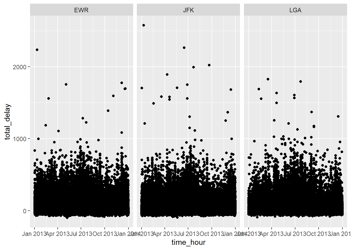
FIGURE6.2: A Scatterplot of Total Delay and Month in Departing Airports in New York
flights %>%
  ggplot(mapping = aes( time_hour, total_delay, color = origin))+
  geom_point()
## Warning: Removed 9430 rows containing missing values
## (geom_point).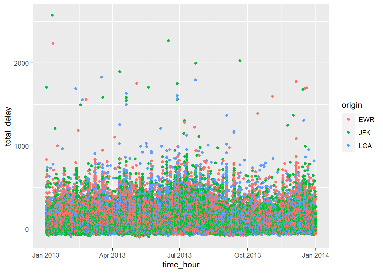
FIGURE6.3: A Scatterplot of Total Delay and Month Using Origin as Third Variable
6.3 Line Plot
In line plot, we draw line for the points of two continuous variables. See Figure 6.4.
flights %>%
  group_by(month) %>%
  summarize(avg_delay = mean (total_delay, na.rm = TRUE)) %>%
  ggplot(mapping = aes(x = month, y = avg_delay)) +
  geom_smooth()
## `summarise()` ungrouping output (override with `.groups` argument)## `geom_smooth()` using method = 'loess' and formula 'y ~ x'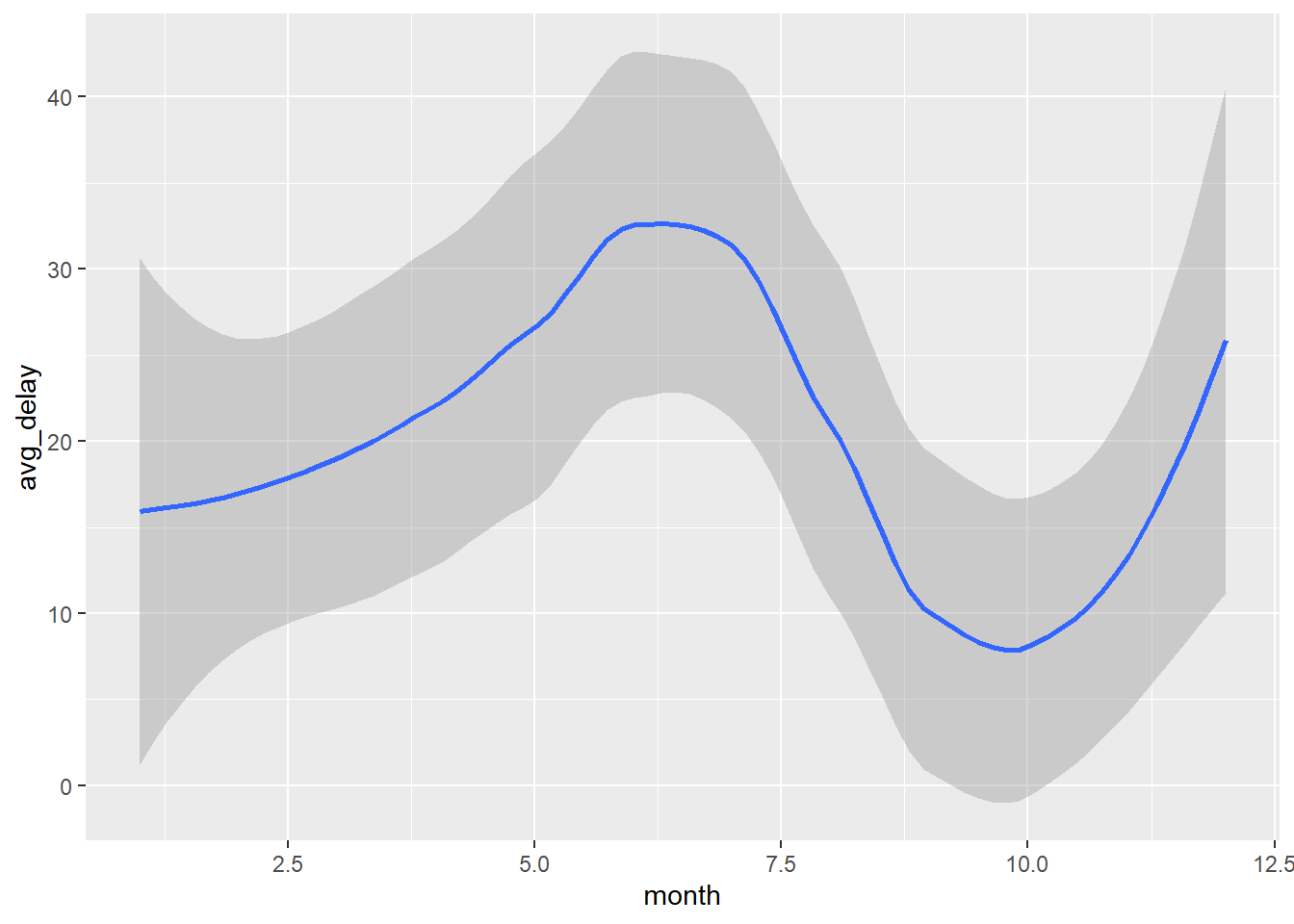
FIGURE6.4: A lineplot of Average Delay and Month
Like scatter plot, a third variable can also be added to the line plot. See Figure 6.5. Also see Figure 6.6.
flights %>%
  ggplot(mapping = aes(x = month, y = total_delay, color = origin)) +
  geom_smooth()
## `geom_smooth()` using method = 'gam' and formula 'y ~ s(x, bs = "cs")'## Warning: Removed 9430 rows containing non-finite values
## (stat_smooth).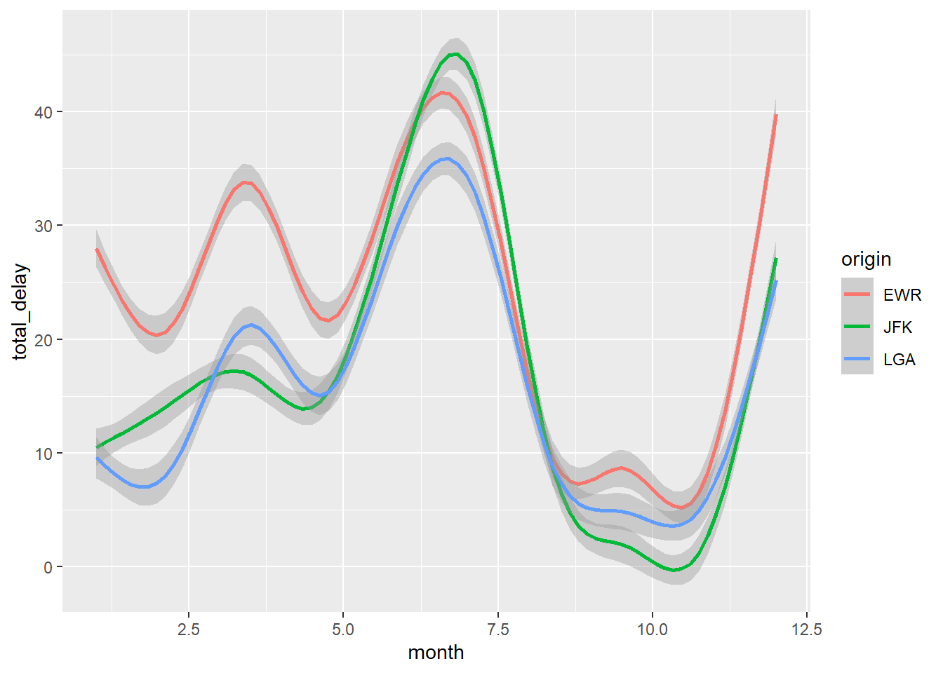
FIGURE6.5: A lineplot of Average Delay and Month Using Origin as Third Variable
flights %>%
  ggplot(mapping = aes(x = day, y = total_delay, color = origin)) +
  geom_smooth()
## `geom_smooth()` using method = 'gam' and formula 'y ~ s(x, bs = "cs")'## Warning: Removed 9430 rows containing non-finite values
## (stat_smooth).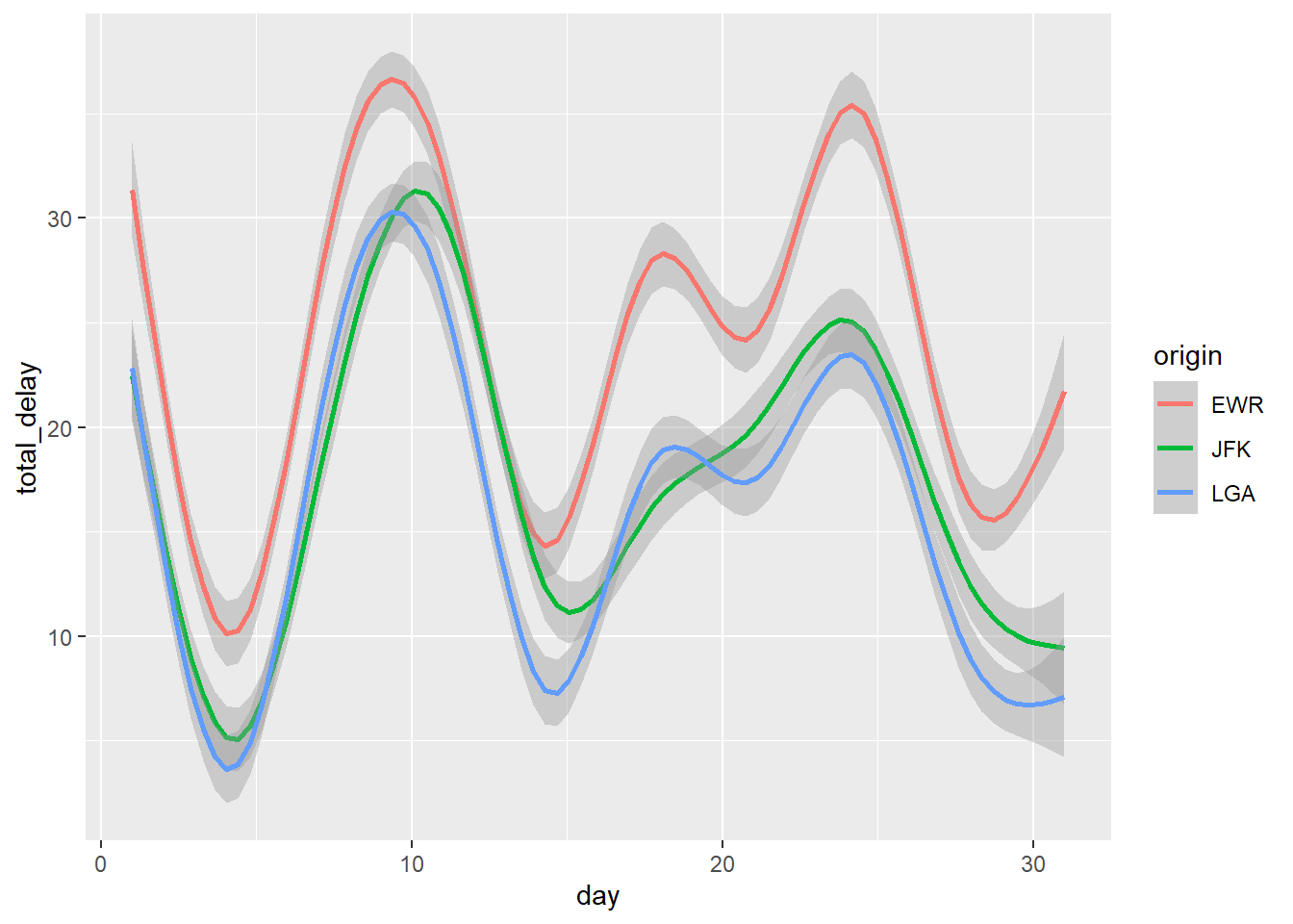
FIGURE6.6: A lineplot of Total Delay and Day of the Week Using Origin as Third Variable
6.4 Bar Plot
We can also create bar diagram. See Figure 6.7.
ggplot(flights, aes(origin))+
  geom_bar()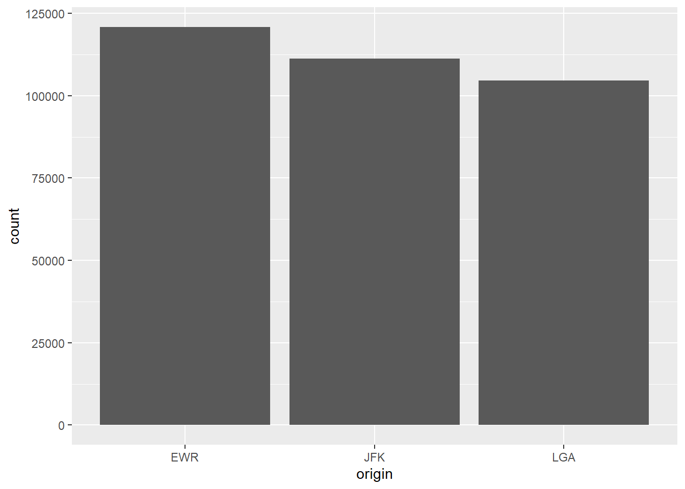
FIGURE6.7: A barplot of Number of Flights from Departing Airports in New York
We can also include a second variable in bar diagram. Please see Figure 6.8. Also see Figure 6.9.
ggplot(flights, aes(origin))+
  geom_bar(aes(fill = as.character(month)))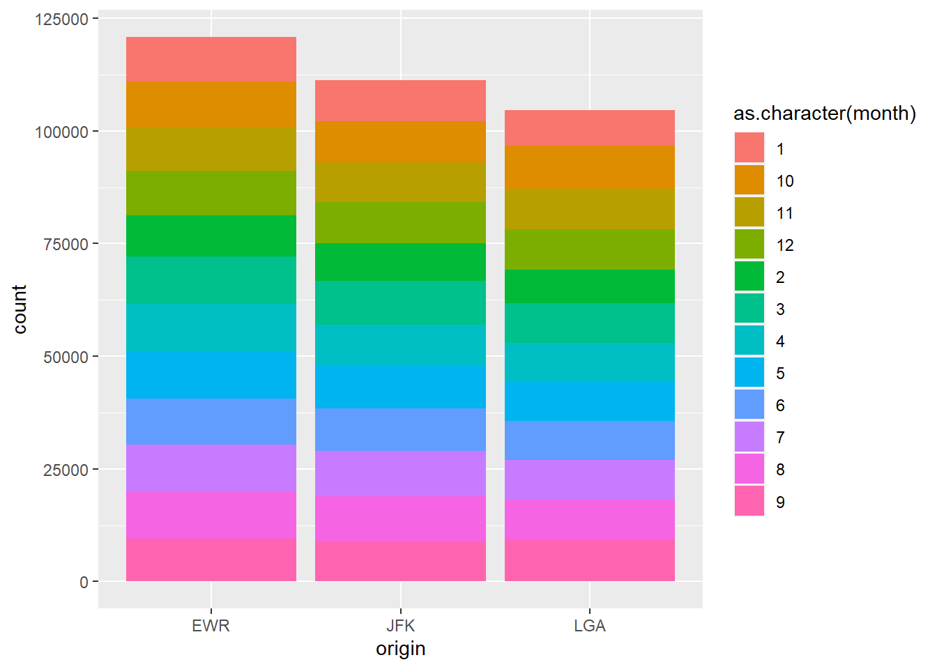
FIGURE6.8: A barplot of Number of Flights from Departing Airports in New York in Different Months
ggplot(flights, aes(origin))+
  geom_bar(aes(fill = carrier))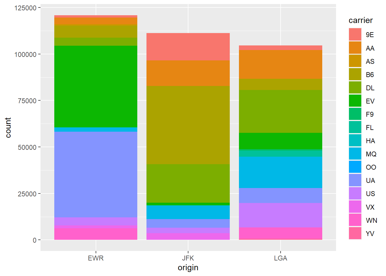
FIGURE6.9: A barplot of Number of Flights from Departing Airports in New York by Different Carriers
From the graph, we can figure out which carriers use which airport most.
6.5 Box Plot
We can also create boxplot using ggplot2. Please see Figure 6.10.
ggplot(flights, aes ( origin,distance))+
  geom_boxplot()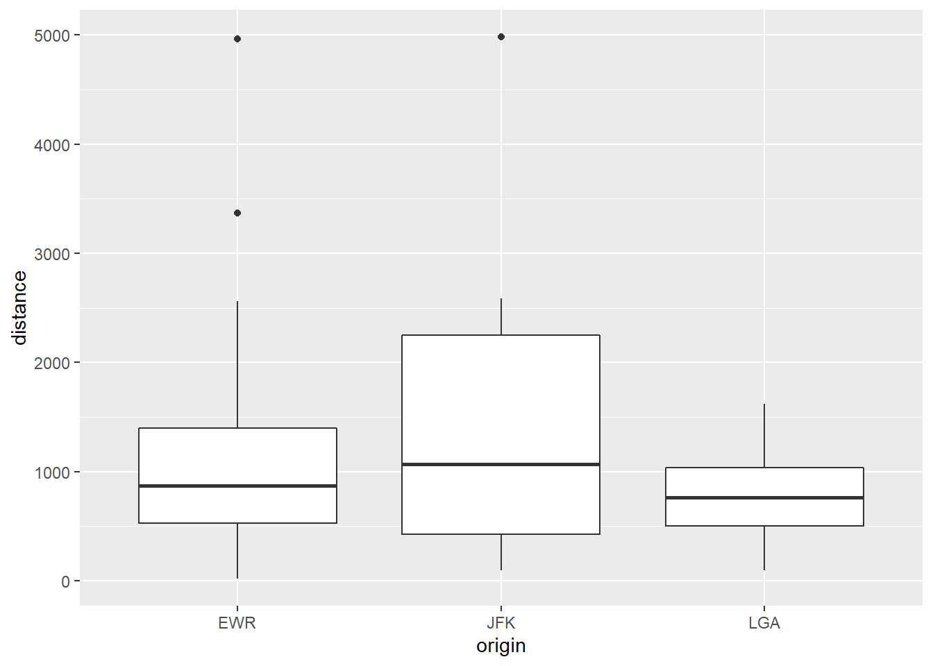
FIGURE6.10: A boxplot of Distance from Departing Airports in New York
It is evident that long distance flights use JFK because it has the highest distance. A thrid variable also can be included in box plot. Please see Figure 6.11.
ggplot(flights, aes ( origin,distance))+
  geom_boxplot()+
  facet_wrap(~ month)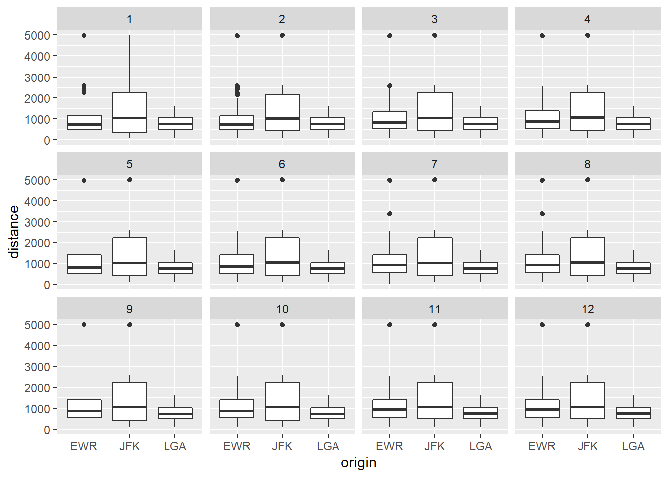
FIGURE6.11: A boxplot of Distance from Departing Airports in New York in Different Months
Here boxplot is created for the distance variables by origin and month variables